Medicine Pixel Perfect SVG UI Icons for Modern Design
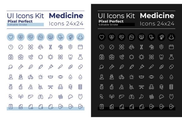
Building a healthcare interface that works well in both bright clinics and midnight telehealth sessions is no small task. The Medicine Pixel Perfect SVG UI Icons Set solves this problem directly by offering two complete icon libraries—one for light mode, one for dark mode—each with 64 carefully crafted linear icons. Whether you are designing a patient portal, a fitness tracking app, or a medical education platform, having icons that adapt to theme without breaking alignment or visual hierarchy saves hours of manual adjustment. This set delivers that consistency from the start.
What Makes This Icon Set Different
Most icon packs treat dark mode as an afterthought, often inverting colors poorly or losing contrast. The Medicine Pixel Perfect SVG UI Icons Set was built with both themes as first-class citizens. Every icon exists in two distinct versions: one optimized for light backgrounds with crisp dark strokes, and another for dark interfaces using subtle light lines that reduce eye strain. The stroke is editable throughout, which means you can tweak thickness, color, or alignment without rebuilding the icon from scratch.
Another standout feature is the use of Montserrat Bold and Montserrat Light fonts throughout the included typography guides. This pairing gives you a clear hierarchy for labels, headings, and body text alongside the icons. If you have ever tried to pair medical icons with a font that feels too clinical or too playful, you know how quickly the visual tone can slip. Montserrat strikes a neutral, professional balance that works across mobile screens, tablet dashboards, and desktop admin panels.
The file formats are practical too: EPS, SVG, PNG, JPEG, and AI. You can drop the SVGs directly into a React component, place PNGs into a slide deck, or open the AI file to customize colors for a specific brand palette. For a design team juggling multiple deliverables, this flexibility reduces friction between tools and team members.
Healthcare Apps and Patient Portals
A patient scheduling screen needs icons that communicate instantly: a calendar for appointments, a syringe for vaccinations, a heart for vitals. With the Medicine Pixel Perfect SVG UI Icons Set, you get all of these in a consistent visual language. The linear style keeps the interface clean, and because the icons are pixel perfect, they remain sharp at 16px, 24px, 48px, or any size you drop them into. When a user switches their phone to dark mode at night, the icon set automatically has a matching version ready—no sudden contrast clashes or invisible icons on a dark background.
Medical Education and Training Materials
Educators and course creators often assemble slide decks, handouts, and interactive modules that mix text with visual cues. Using this set, you can pull a pill icon for pharmacology modules, a DNA strand for genetics lessons, or a microscope for lab procedures. Because the icons are provided in both themes, your slide deck works just as well projected on a bright screen as it does when students view it on their tablets in a dimly lit lecture hall. The editable stroke also lets you highlight specific elements by thickening the line weight for emphasis during instruction.
Telehealth Platforms and Remote Monitoring Dashboards
Telemedicine dashboards display a lot of data in a small space—appointment status, medication reminders, vital sign trends. Icons here need to be immediately distinguishable at a glance. The linear UI icons in this set use clear silhouettes and minimal detail, so a blood pressure icon does not get confused with a thermometer icon. For entrepreneurs building a white-label telehealth product, having both day and night icon sets means you can ship a polished theme toggle without extra design work.
Health and Wellness Blogs or Newsletters
Publishers and bloggers covering health topics often use icons as bullet points, section dividers, or social media graphics. Because the set includes JPEG and PNG exports, you can place icons directly into email templates or CMS blocks without needing a graphic editor. The light mode icons work beautifully on white newsletter backgrounds, while the dark mode versions sit cleanly on dark-themed landing pages. If you run a weekly health digest, you can batch-create visuals for an entire month using these consistent icon styles.
Usability and Efficiency Benefits
The main time-saving feature here is the ready-to-use dark and light pair. In standard icon workflows, you might find a good icon in light mode, then spend ten minutes manually creating a dark version that matches your site's accent color. With this set, both versions are already aligned, scaled, and tested. You simply drop them into your design system.
Editable stroke also gives you control when client feedback comes in. If a stakeholder says the icons feel too thin at small sizes, you can increase the stroke weight across the set in one step if you are working from the AI or EPS originals. No need to redraw each icon.
For developers integrating icons into production apps, SVG format means you can control color via CSS, which makes theming dynamic. You can swap between the light and dark SVGs based on user preference without reloading assets. This keeps your bundle lean and your interface responsive to system settings.
Realistic Use Cases and Observations
I have seen teams buy a single icon pack and try to stretch it across light and dark themes by inverting colors programmatically. The result is often icons that look washed out or lose legibility. This set avoids that by providing crafted variations that account for contrast perception on different backgrounds. For a medical app serving older adults—where readability is critical—this attention to contrast reduces cognitive load.
Another scenario: a freelancer building a mental health journal app on a tight deadline. Instead of designing 64 icons from scratch or sourcing them from multiple free libraries with inconsistent styles, you can use this set as the baseline for the entire UI. The Montserrat font pairing also gives you a clean typography system without needing to browse Google Fonts for compatibility. This cuts design time by days, especially if you are working solo.
For marketing teams creating campaign landing pages for medical devices, the PNG and JPEG exports allow quick mockups for A/B testing without involving a developer. You can drop a pill icon next to a headline like "Daily Wellness, Simplified" and test two background themes in the same afternoon.
Practical Considerations When Using This Icon Set
- Sizing consistency: Because icons are pixel perfect, they stay crisp at multiples of standard UI sizes. Aim to use them at 24px or 48px for most interfaces. Avoid placing them at odd values like 37px, which can cause sub-pixel rendering.
- Color handling: The stroke is editable, but try to keep the stroke color within your brand's accessible contrast ratios. For dark mode, a stroke of #E0E0E0 on a #121212 background works well. For light mode, #1A1A1A on #FFFFFF maintains legibility.
- File organization: The pack likely arrives with folders for light and dark versions. Keep these separate in your asset library so team members pull the correct version. If you use a tool like Figma, import each theme as a separate component set.
- Font integration: Montserrat Bold and Light are free fonts, but make sure you load them via Google Fonts or bundle them in your app. If you substitute another font, test the visual weight pairing—some sans-serifs may feel too heavy next to the thin linear icons.
- Licensing clarity: Check the license terms for commercial use if you are building a product you plan to sell. Most icon sets from reputable studios allow commercial use, but confirming this upfront avoids legal friction later.
Who Benefits Most from This Set
Entrepreneurs building healthcare or wellness apps will find the dual-theme support especially valuable because it removes one more variable from the launch checklist. Marketers creating campaign assets for medical practices can use the icons across print and digital without style drift. Educators developing health curriculum materials get a consistent visual language that works in slides, handouts, and online modules. Freelancers juggling multiple clients can standardize on this set for any health-related project, reducing the need to hunt for new icons each time.
Even hobbyists building personal health trackers or family medication logs can use these icons to elevate a side project into something that looks like a polished product. The free fonts and multiple file formats keep the barrier low—you do not need a full Adobe subscription to use the PNGs or SVGs effectively.
Final Thoughts on Implementation
The Medicine Pixel Perfect SVG UI Icons Set is not just a collection of shapes—it is a focused tool for creating interfaces that feel intentional in any lighting condition. The dark and light modes are genuinely separate builds, not lazy inversions. The inclusion of Montserrat fonts, editable strokes, and multiple formats makes it practical for solo creators and large teams alike.
If you design health-related interfaces regularly, having a dedicated medical icon set with proper dark mode support will save you repeated adjustments and keep your user experience consistent from breakfast to bedtime. Subscribe to BSD Studio for weekly updates on new topics and discounts, so you can stay current with evolving design trends without constantly rebuilding your asset library from scratch.